close
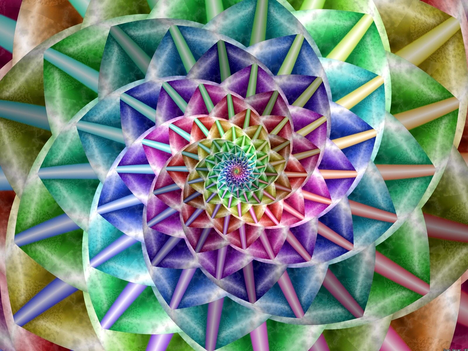
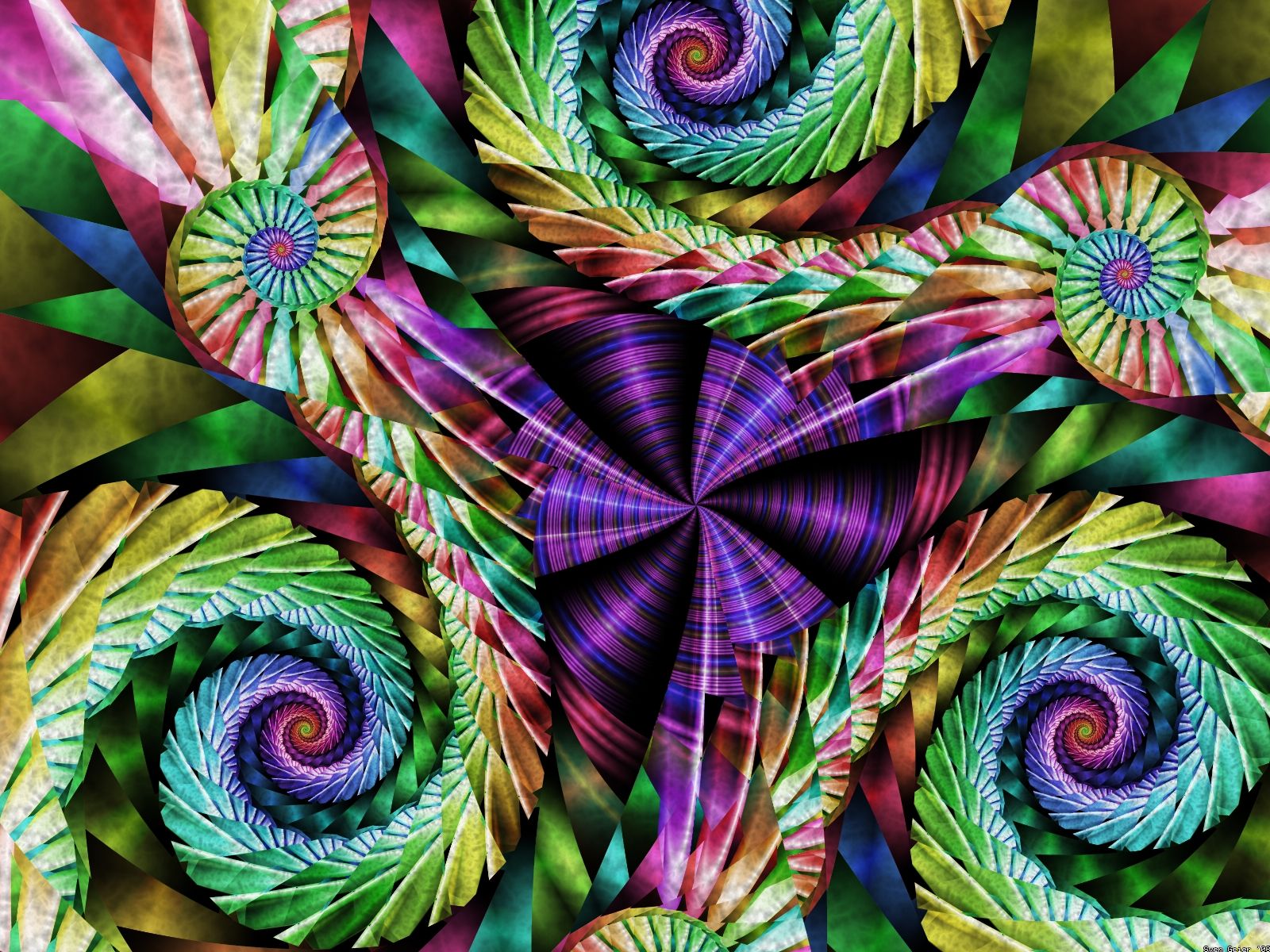
Artistically speaking, 2003 was a bust. I simply, plainly didn't have
any time for artwork. Thus much of what you see here is derivative of
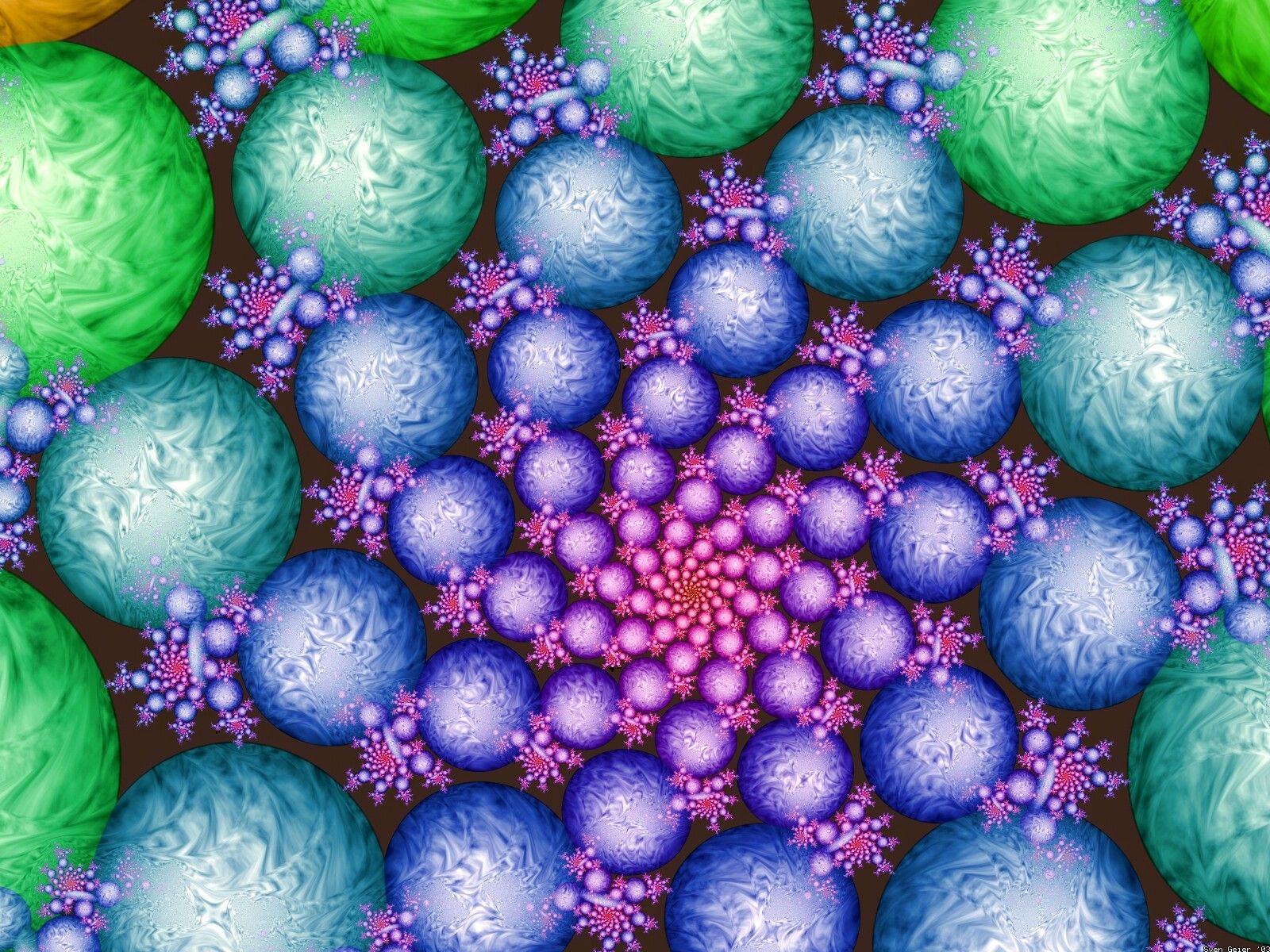
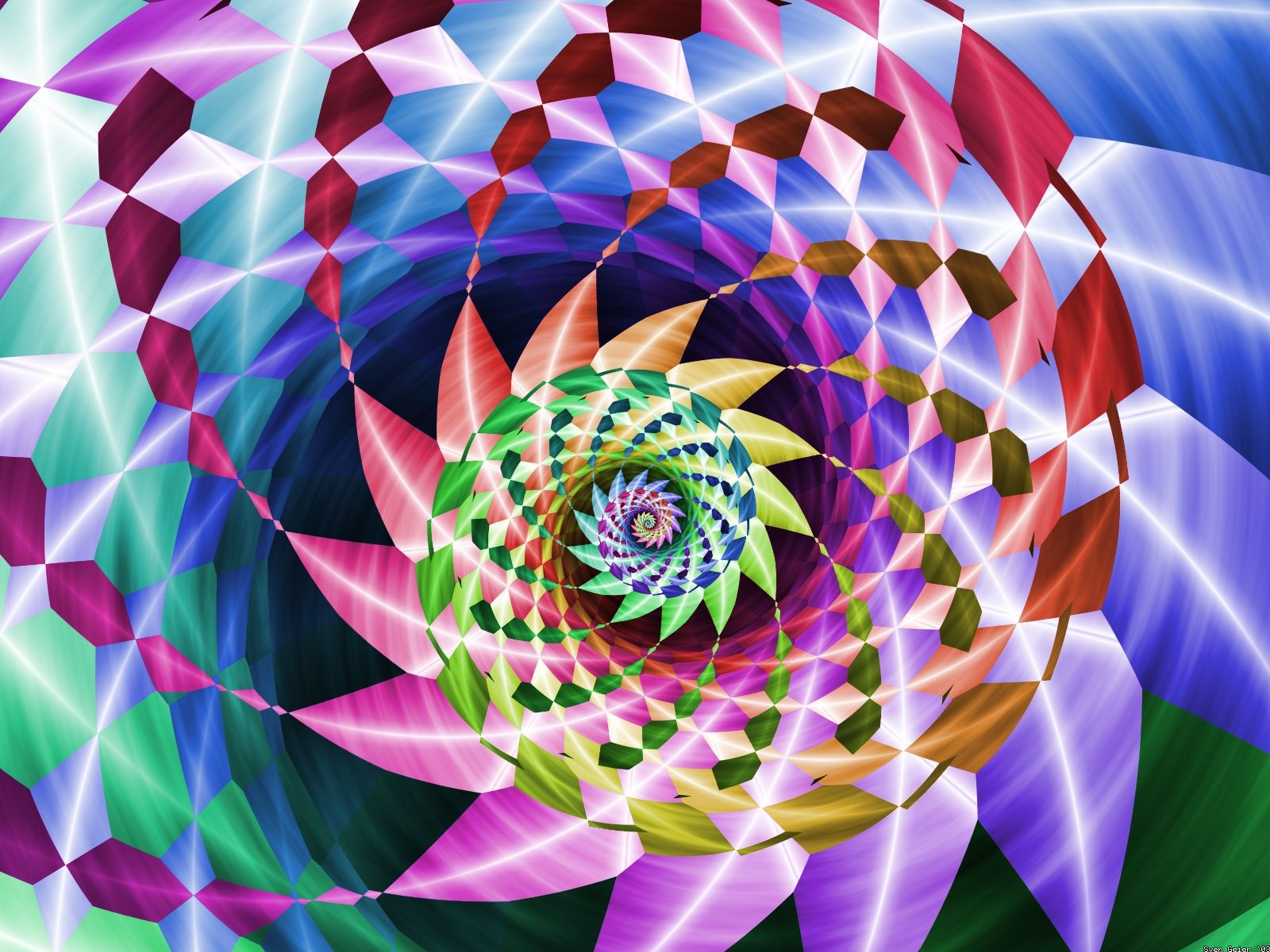
something else I had done ("Harlequin snail" obviously derived from
"Spiral" for example), the colors tend towards simple rainbows, the
compositions are choppy, light and saturation are uneven.
In late july of 03 I went to Tokyo on a work-related trip and never
managed to get back to UF after my return until november, when I flew
to
antarctica and
thus the year was cut short.
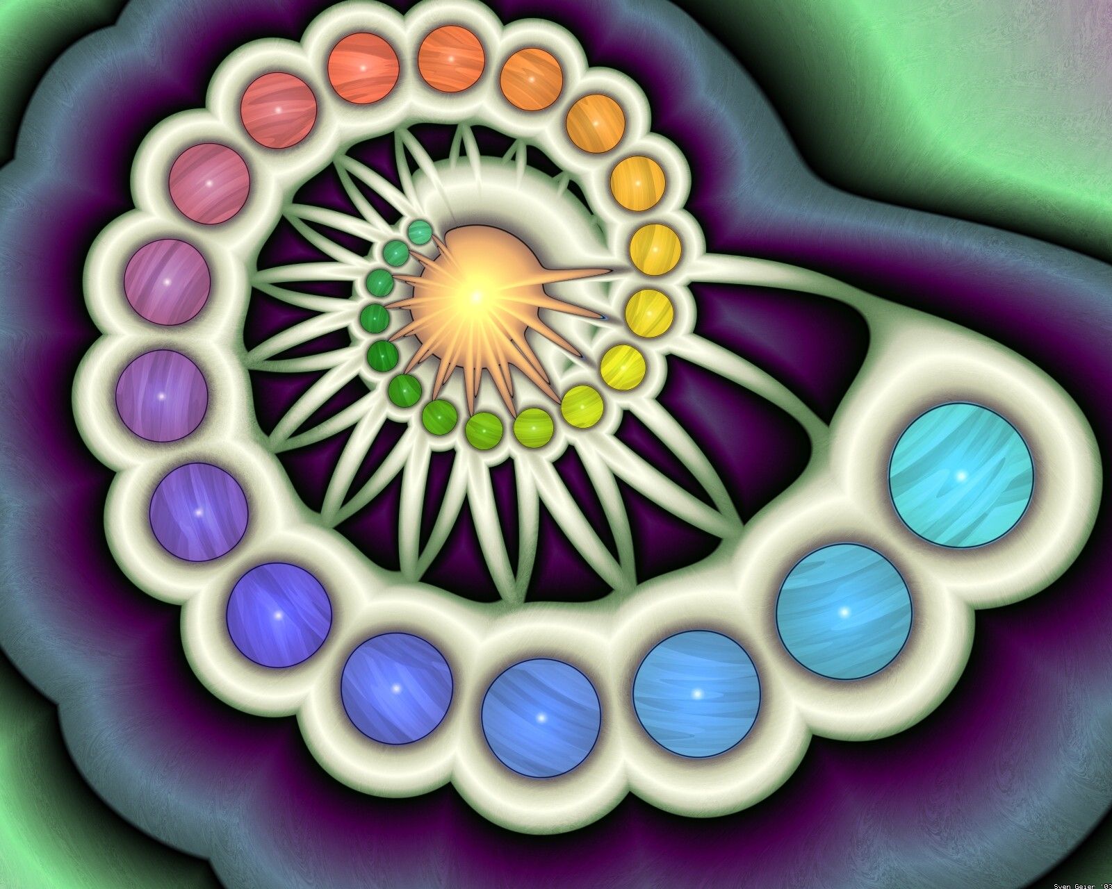
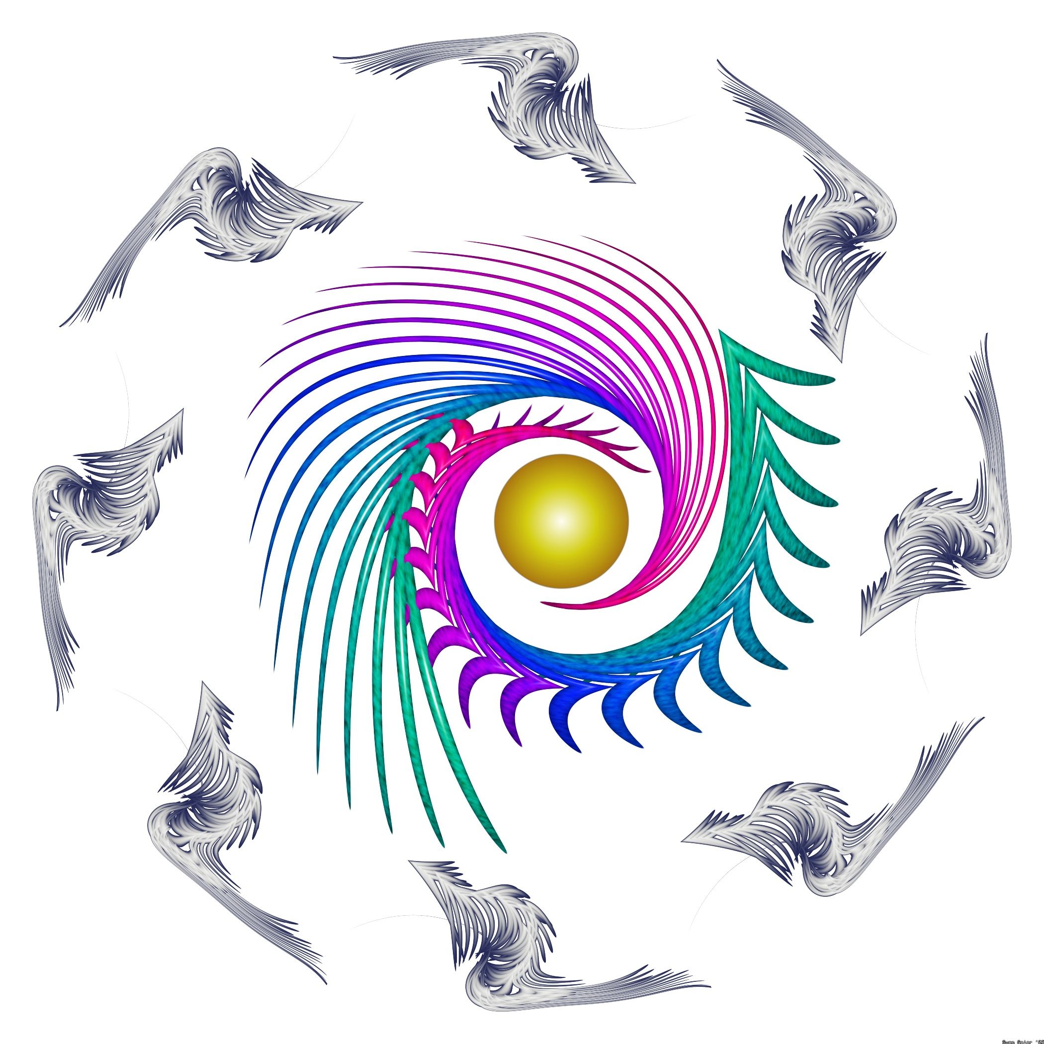
Weirdly, this was the year when I got my first "publication" offer --
a CD cover on which the client wanted the sun-like thing in "badge"
(the CD had the same rainbow twirl printed on it but where the sun
would be is the hole in the CD). I was more than happy to make the
image to the client's satisfaction, in part because I simply didn't
have the time to put into any kind of creative input into the process.
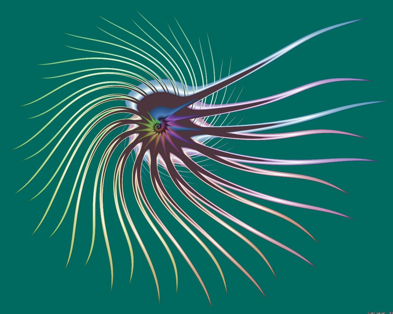
I'd like to note the lense-glare in the center of "Flutter" which
makes its debut here and which I re-used (and re-ab-used) a lot in
2004 as a kind of desperation-device when I can't quite figure out
what to do in the center of an image. It looks harmless enough, but
I'm actually kind of embarrassed about it.
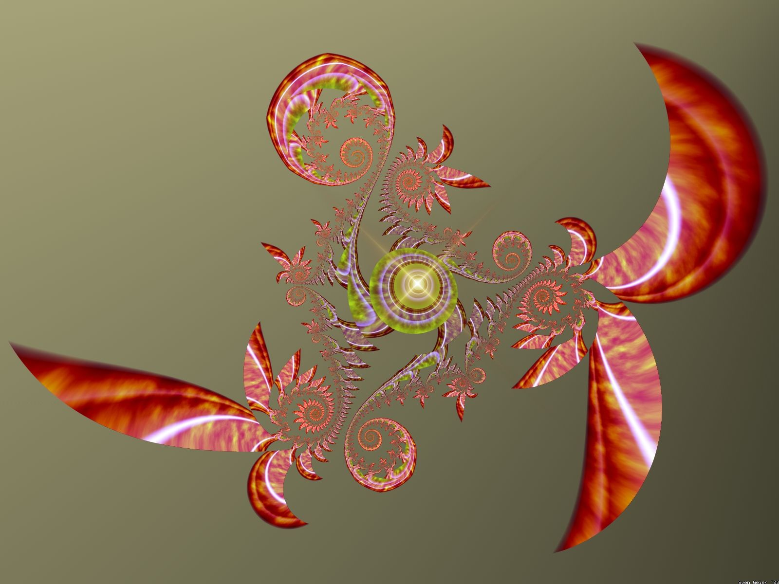
The only image from that year that I still really like - as crude and
roughly hewn as it is - is "Copernicus". Unsurprisingly it is also the
only image in the lot that took some real time and effort to create.